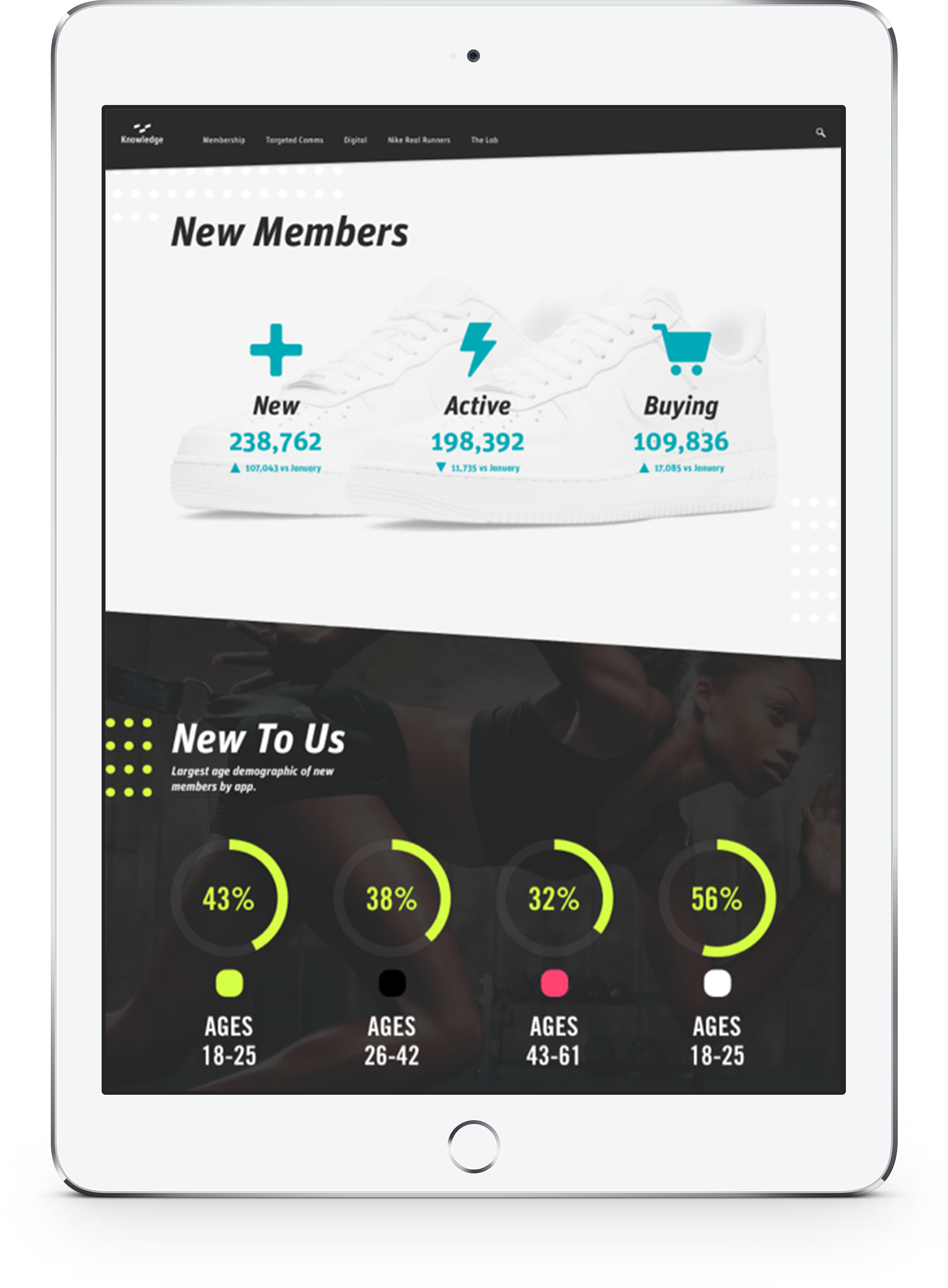
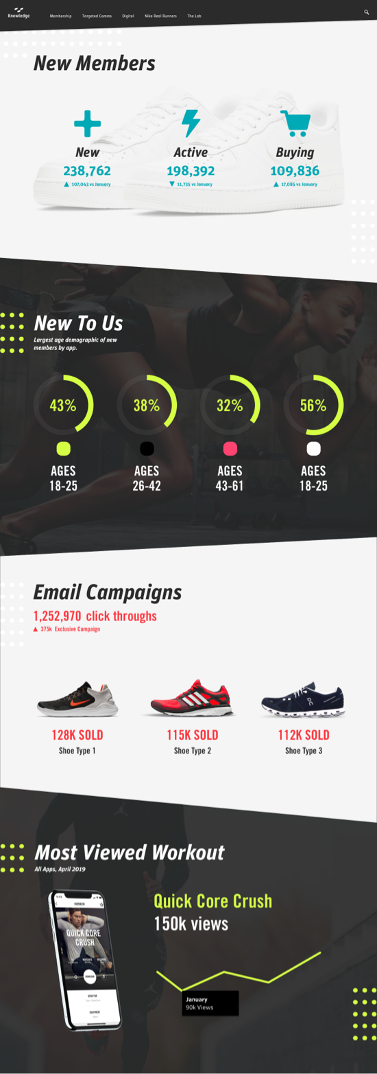
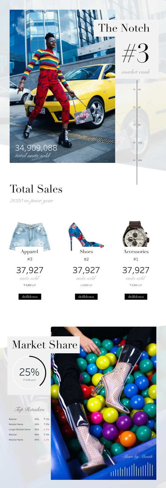
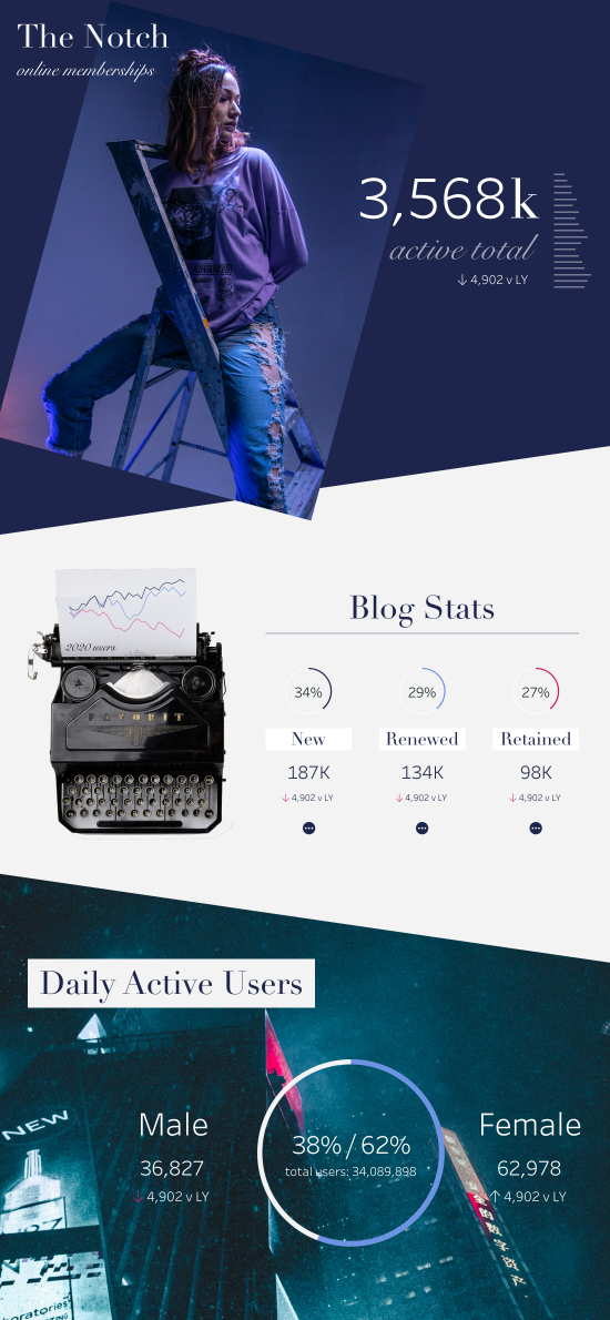
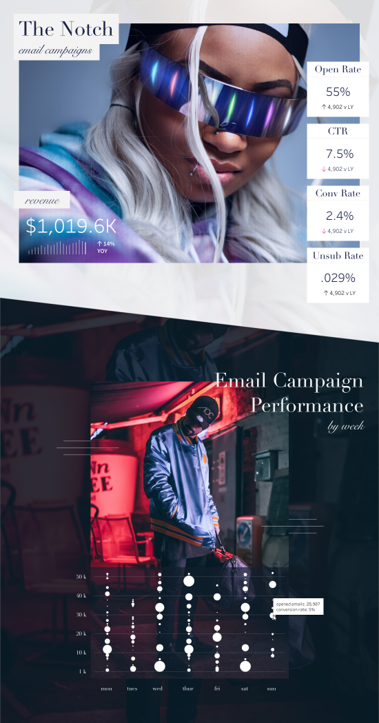
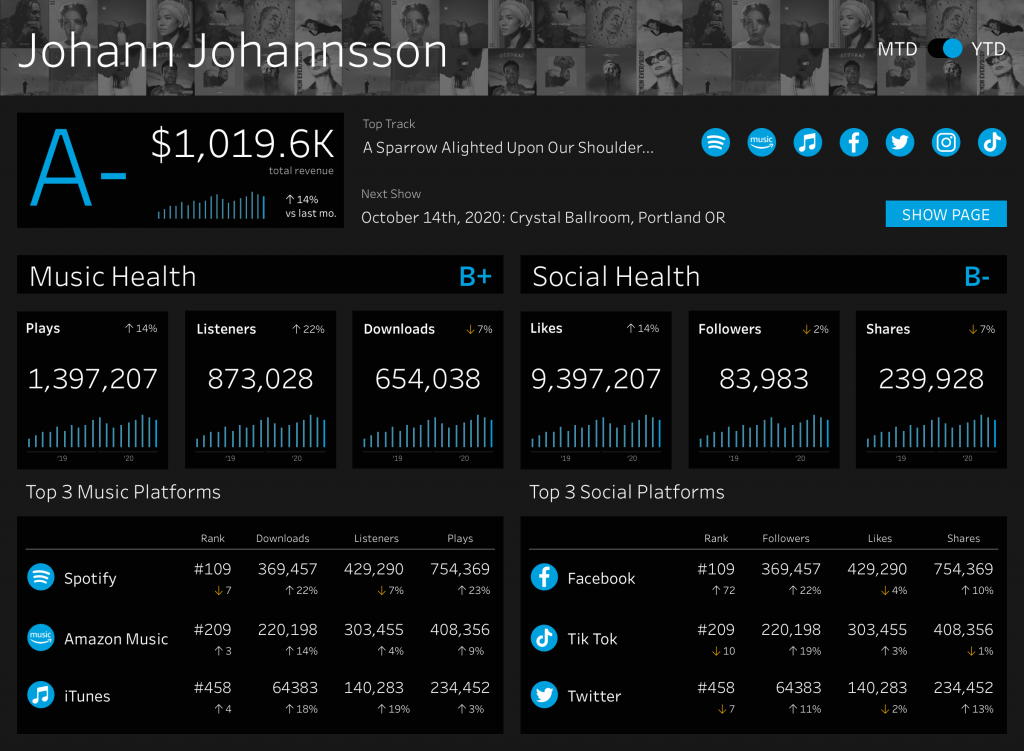
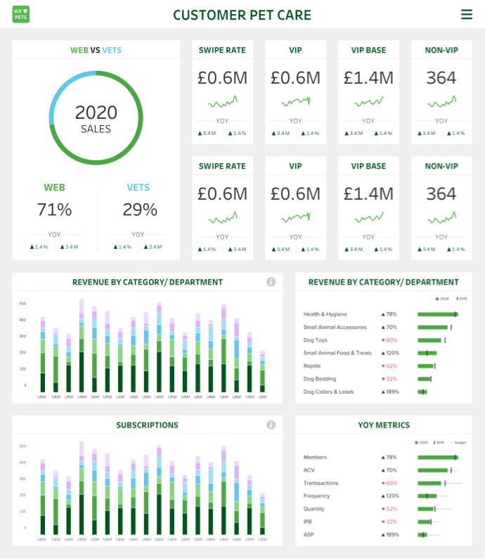
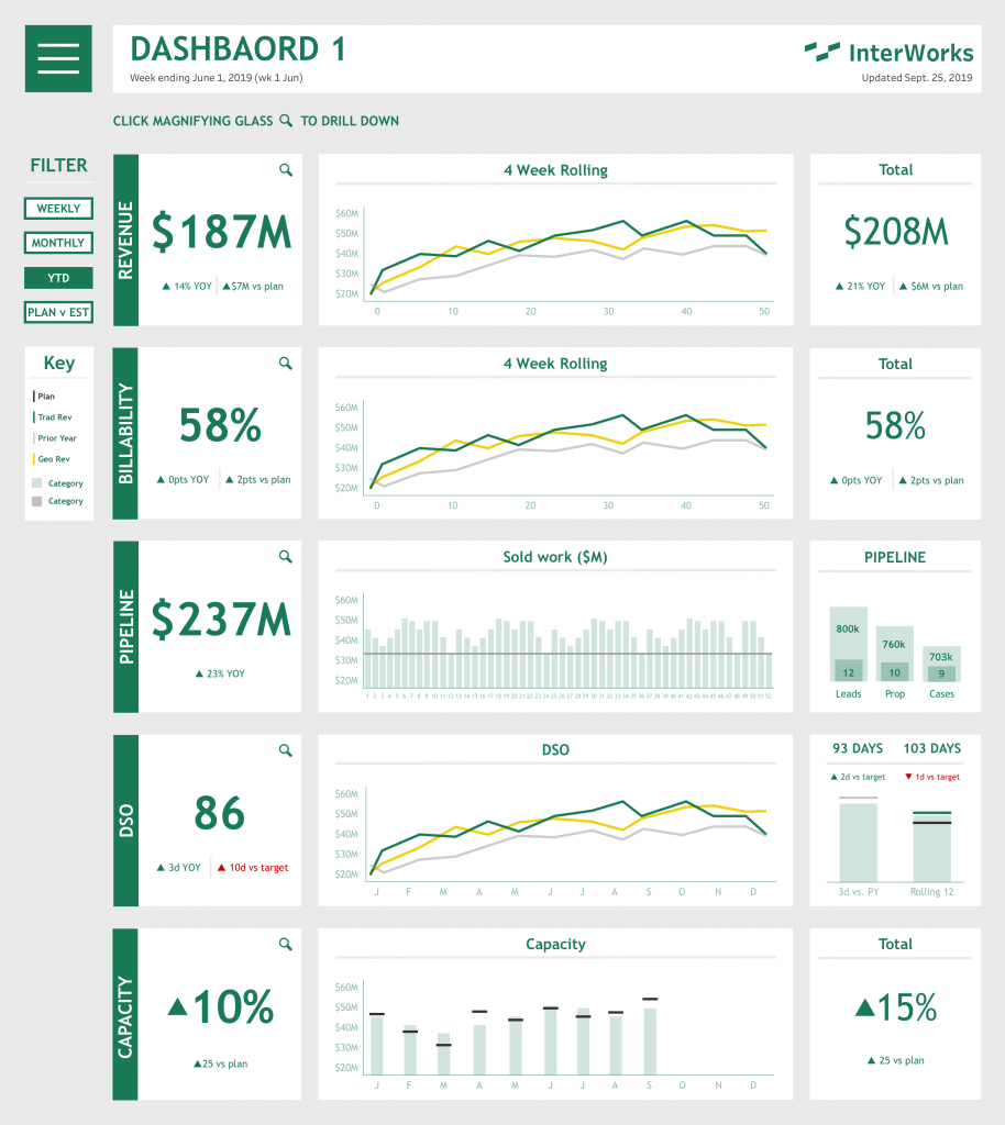
Designing for Data
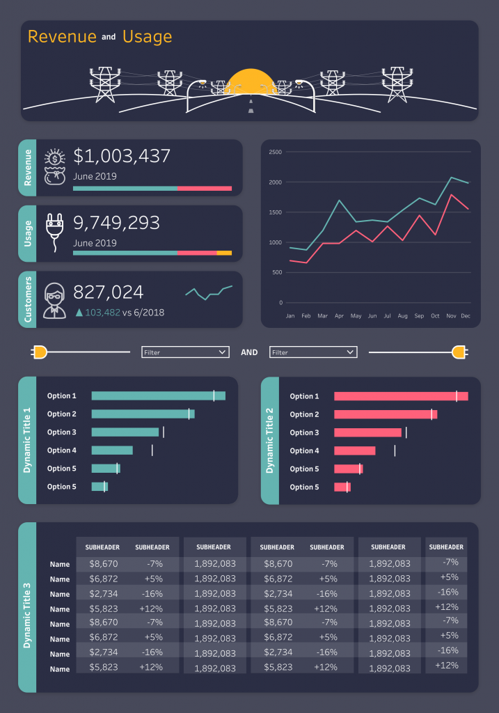
Part of my job at Interworks was to make data interesting and accessible to the average person. Often this meant converting boring spreadsheets into visually intriguing reports that could be accessed and shared via Tableau. However, because Tableau is first and foremost a tool for data (not design) design options were limited. This made for an interesting UX problem: How do you display large amounts of data with limited functionality? Is it possible to trick users into thinking they’re using a standard website so even novice Tableau users can find what they need? The answers are yes and yes. By leveraging the UX basics of hierarchy, consistency, and control, I designed dozens of Tableau reports that functioned and looked like modern web experiences. Below you’ll find a few examples.
⚠ Please note: All identifying client data has been removed from the below reports. ⚠
Role in Project: UX Designer
Objective: Create a set of easy-to-read reports which tell a cohesive story about a given company or project.
How: Highlight key performance indicators (KPIs) and create a “data hierarchy” which prioritizes broad metrics while still allowing users to access more granular reports.