Curator Backend Redesign

About Curator

Curator by Interworks is a data portal and SaaS product design to make analytics accessible to a broad audience. It integrates tools such as Tableau and Power BI and strives to create a branded web experience so simple that everyone from CFO’s to entry-level team members can customize, display, and share company data. 


Project Summary

Role in Project: Lead UX Designer

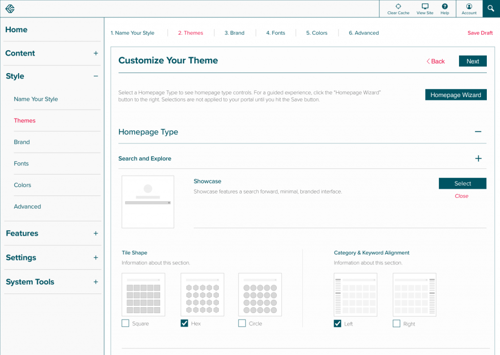
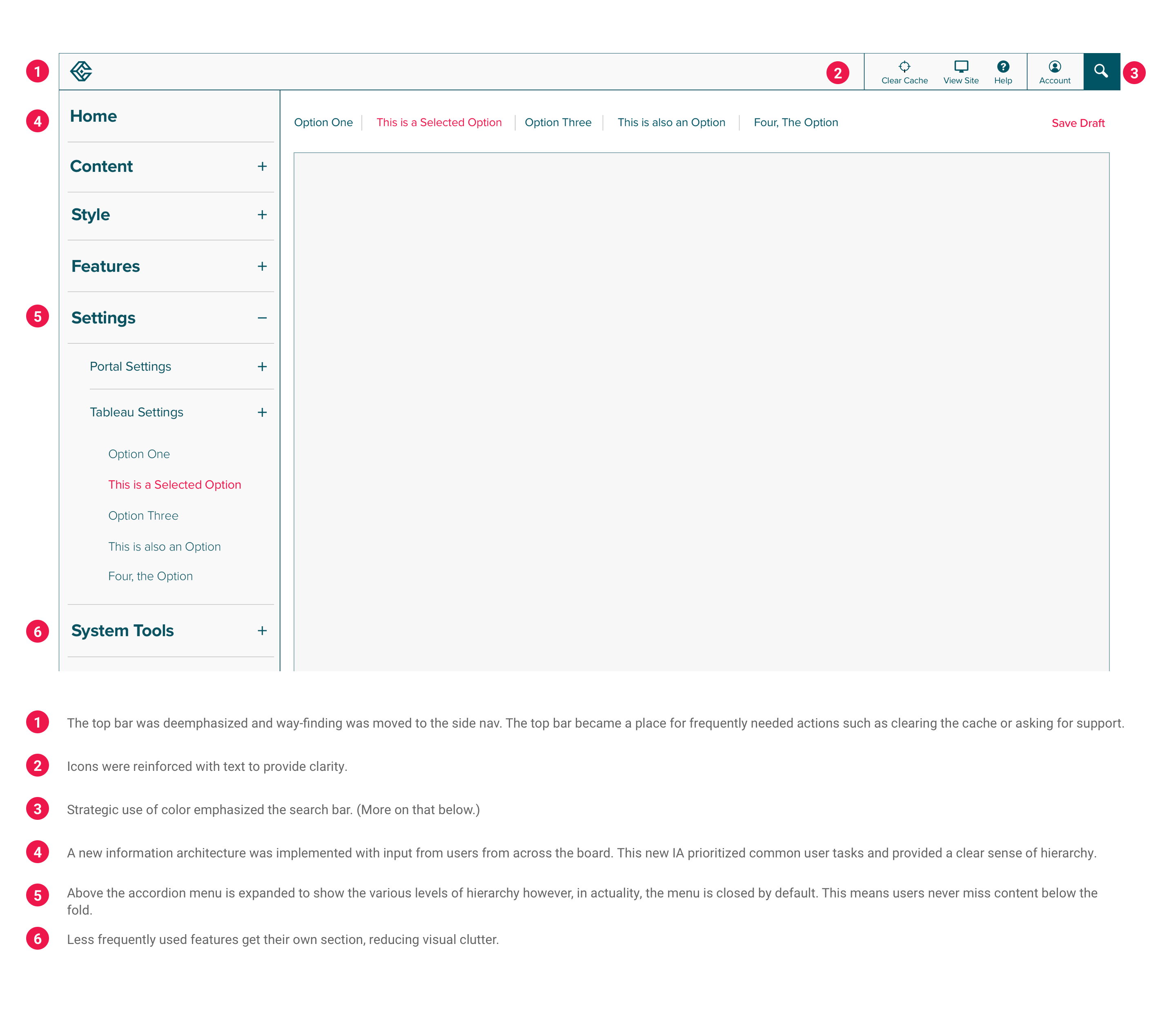
Objective: Create an intuitive, accessible, client-focused backend experience which allows users to customize their Curator sites without the help of developers.

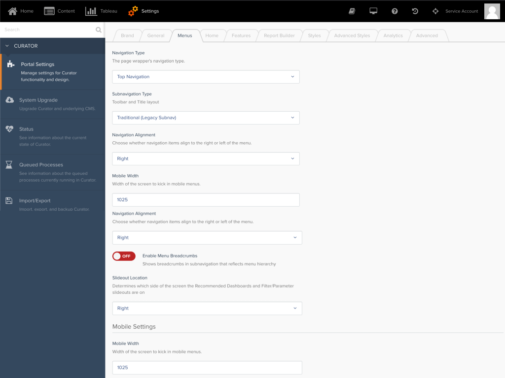
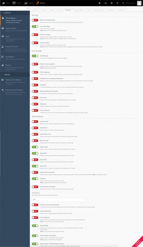
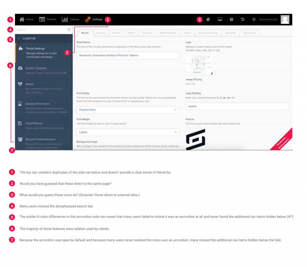
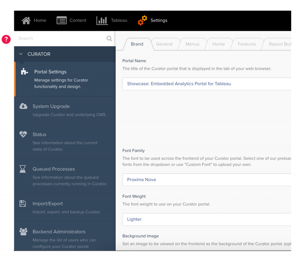
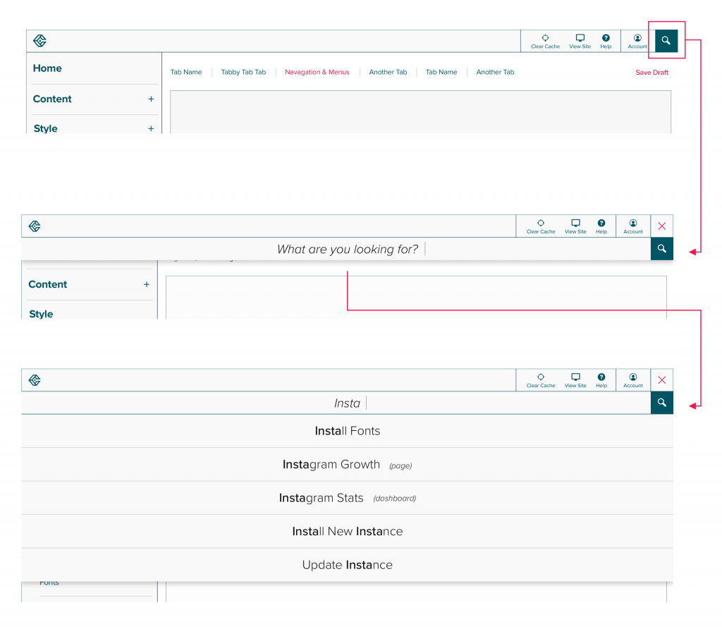
How: Overhaul the information architecture to reflect common user tasks. Use consistent visual aids, common iconography, and plain speech to convey settings. Ask users to make fewer options at once. And prioritize large product fixes and innovations over one-off client needs. 

Curator Backend After vs Before 

The Problems

Curator was touted as a fully customizable and user-friendly web product. But in 2019, it became clear that everyone from clients to designers to Interwork’s own analysts seemed unsure of what the tool was capable of or even how to use it. The tool we claimed was so user-friendly often had to be customized by Interwork developers using code and the results were sites that looked outdated.

Even more concerning was the way Interworks approached these problems. Our dev team spent most of their time repeating the same tasks: installing Curator, customizing it for clients, and answering the same basic questions on how to use it. Little time was spent on product innovation and improvement. The Curator team prioritized quick development fixes over long-term solutions and the result was a large amount of technical debt and product that was quickly falling behind the times. 

The backend overhaul aimed to align Curator with its long-term mission of being the “Squarespace for data.”


Our Solutions

Below, I’ll walk through our solutions to some of Curator’s UX problems. I’ll cover:

    1. Simplified Navigation
    2. Visual Enhanced Controls
    3. Page Builder

Before, Curator’s solution to everything seemed to be “add another toggle!”

1. Simplified Navigation

From duplicate nav items with different names to mystery icons that linked to external sites, Curator’s navigation needed some help.

 Take a look at the tabs below to see the difference user input made.

Making the Search Feature Discoverable 

Before:

The search feature sat low in the visual hierarchy and was often missed by users. Its position below the top nav led some to wonder whether the search was global or localized to the contents of the side nav.

After:

The global search feature sits high in the visual hierarchy and provides users with suggestions that include everything from user-added content to Curator features and how-to articles.

2. Visually Enhanced Controls

The Problem:

In order to customize and style the front-end, users had to hunt down settings throughout various tabs. Often settings were relegated to a drop-down or toggle with overly technical names or explanations and zero visual feedback. As a result, Interworks consultants and developers spent an estimated 60% of their “on-call” time answering the same basic questions.

The Solution:

The redesign consolidated features and front-end style controls and provided users with plain text or visual explanations of nearly every setting.

The result is a truly user-friendly interface that not only empowers clients but also frees up time for the dev team to innovate.

↓ Scroll through the container below to view the Themes page ↓

3. Page Builder

The Problem

Curator was billed as a plug-and-play web tool however, the legacy page builder feature was unintuitive, visually clunky, and provided too many controls too soon (often giving users a sense of decision fatigue). To make matters worse, the page preview often didn’t accurately communicate how new pages or page features would display. 

The legacy page builder also had limited design features. Users could only have one or two columns per row and there was no way to easily swap page elements. This meant that if users made a mistake while designing their pages, entire rows —along with the contents of the row —often had to be deleted and re-built.

Sadly, I don’t have a before picture for this user flow.

The Solution:

Page Builder‘s visual overhaul gives users the tools they need to make informed decisions each step of the way (without overloading them with options.) The new Page Builder helps users populate pages in three simple steps.

Additional Information

Check out the style guide here. If you want to know more about this project and my role in it, drop me a line.